Articles Color Your World
January 25, 2018Be brave, be bold, be COLORFUL! Pantone and the most popular paint companies have declared the colors of 2018. There is no doubt that color can energize or soothe, creating a feeling of warmth or coolness in a room. Whether you bring these colors in with paint, furniture, rugs and accessories, or with your wall tile, countertops or floor tile, your space will amaze and reflect style.
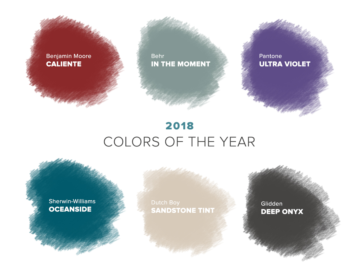
 photo: Dwell | Casey Dunn
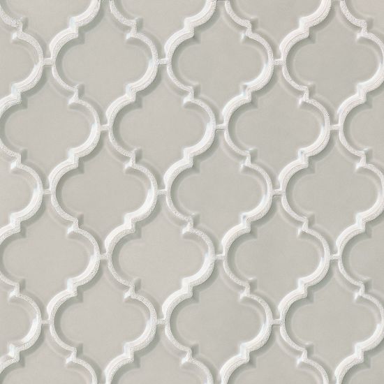
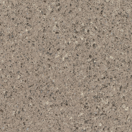
 Pantone - Ultra Violet evokes mindfulness, spirituality, creativity, experimentation, and non-conformity. But it can be a challenge to introduce to a room. To successfully add it, try paint, rugs, pillows and art and choose tile or counters that complement purples. Below is a selection of mosaics that can used on a fireplace or backsplash. Use soft earth-tone porcelain on the floor and warm grey quartz on your counters.
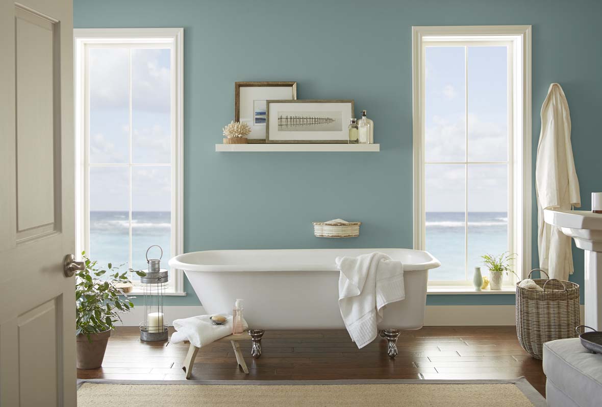 photo: Behr Paint
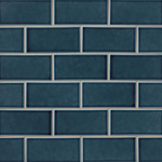
 Behr - In the Moment. This cool, tranquil, spruce blue is inspired by nature and is a soothing, restorative blend of blue, gray and green. This comfortable color creates a sense of sanctuary and relaxation amid our busy lives. Also a popular hue in tile and stone, we have many options to choose, from stone to glass to porcelain. Explore the Bedrosians collections that bring this color to life and will add tranquility to your space.
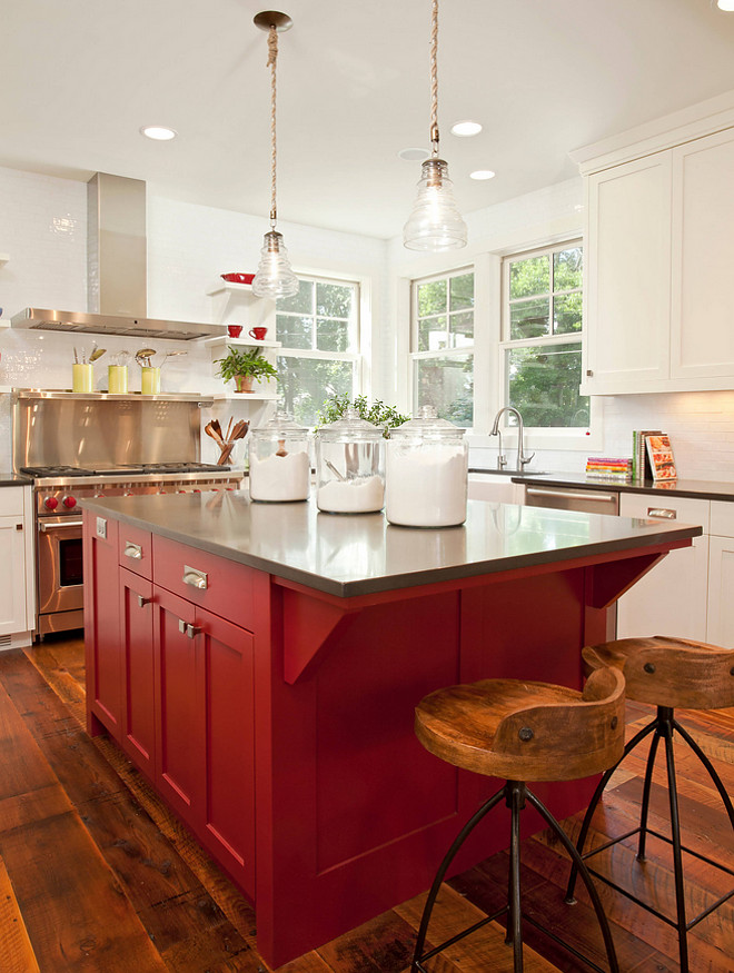 photo: Benjamin Moore
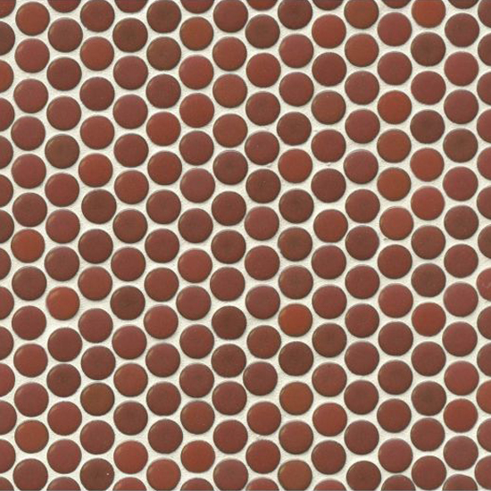
 Benjamin Moore - Caliente. Strong, radiant and full of energy, Caliente projects total confidence. "It is pleasing, passionate and makes people feel special, like 'red carpet treatment'," says Ellen O'Neill, Benjamin Moore Director of Strategic Design Intelligence. What's makes Caliente so versatile is its ability to complement so many other colors, like black, white, brown, yellow, blue and even shades of green. To find your expression of red, go with tile or stone in that shade or find products that will coordinate with painted cabinets or walls, like we're showing below.

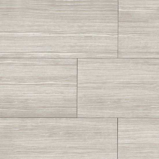
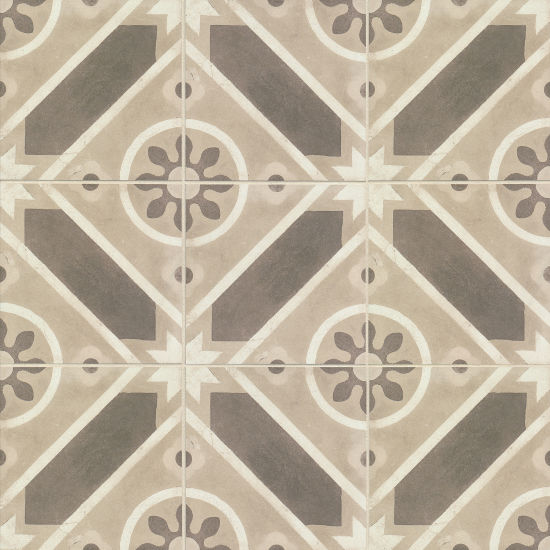
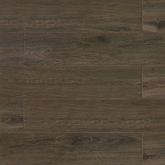
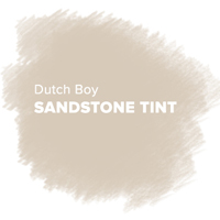 Dutch Boy - Sandstone Tint. Add a touch of modernity and minimalism with this perfect beachy neutral that can be incorporated in any room throughout your home. This color can be warmed up with dark drowns and russet reds or cooled down with watery blues and leafy greens. Whichever direction you go, your space will feel restful and enveloping.
 photo: Sherwin Williams
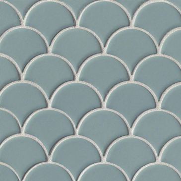
 Sherwin Williams - Oceanside. "People today have a growing sense of adventure, and it is making its way into even the coziest corners of our homes. We are craving things that remind us of bright folklore, like mermaids and expeditions across continents," said Sue Wadden, Sherwin-Williams director of color marketing. "Oceanside is the color of wanderlust right in our own homes." Bedrosians offers glass and tile in this color and various shades in between. Go bold with a whole wall or use it as an exciting accent with more neutral tile options.
 Glidden - Deep Onyx. A true black, with no hints of blue, Deep Onyx creates of mood of mystery and privacy. With this color, not only can you add it with paint, but also with your tile and stone choices. Because black is an enduring color, you can feel confident when using black tile on the floor or as an accent wall. Decorators recommend using a matte finish to dial up the style. For a whole look, try a black tile or mosaic backsplash paired with a luscious Infinity Quartzite countertop. The soft onyx veins on the light grey field will pop and bring your room together.


